Mostly for my own benefit, I thought I'd walk through the process of the last piece I did. I'll try and point out the steps in the process that have been breakthroughs for me. This is still going to be pretty general-not a full blow tutorial-so if you have any questions, feel free to drop me a line.
Okay, so a couple of nights ago I was feeling like pushing myself to do something dynamic, unique and a little sexy. I had just read through Claire Wendling's drawers 4.0 sketchbook, and was very inspired, and I had picked out a couple of visuals things she had done that I wanted to try out.
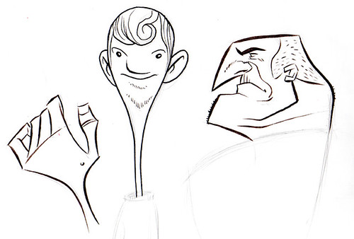
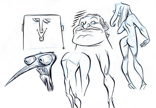
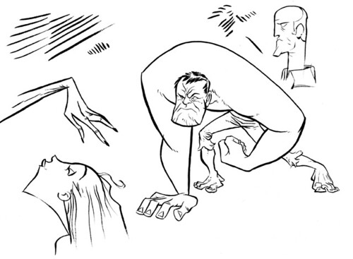
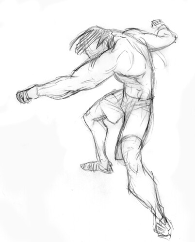
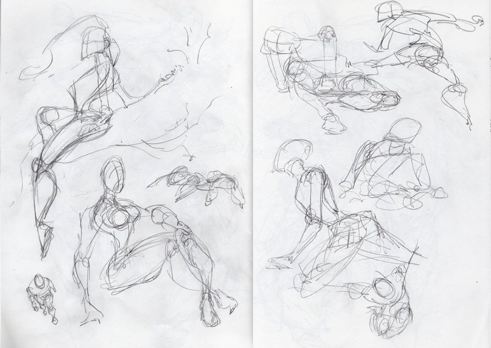
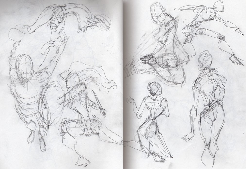
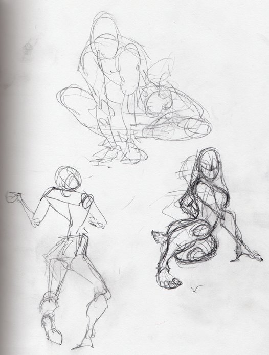
So I started by doodling a bunch of poses in my sketchbook, just trying to loosen up and find something that really grabbbed me. I tried to focus on using interesting shapes to build the poses, to try and break myself out of the cliches of what an arm or a torso, or a head should look like.
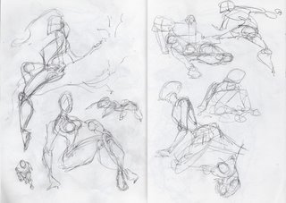
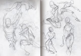
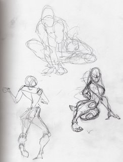
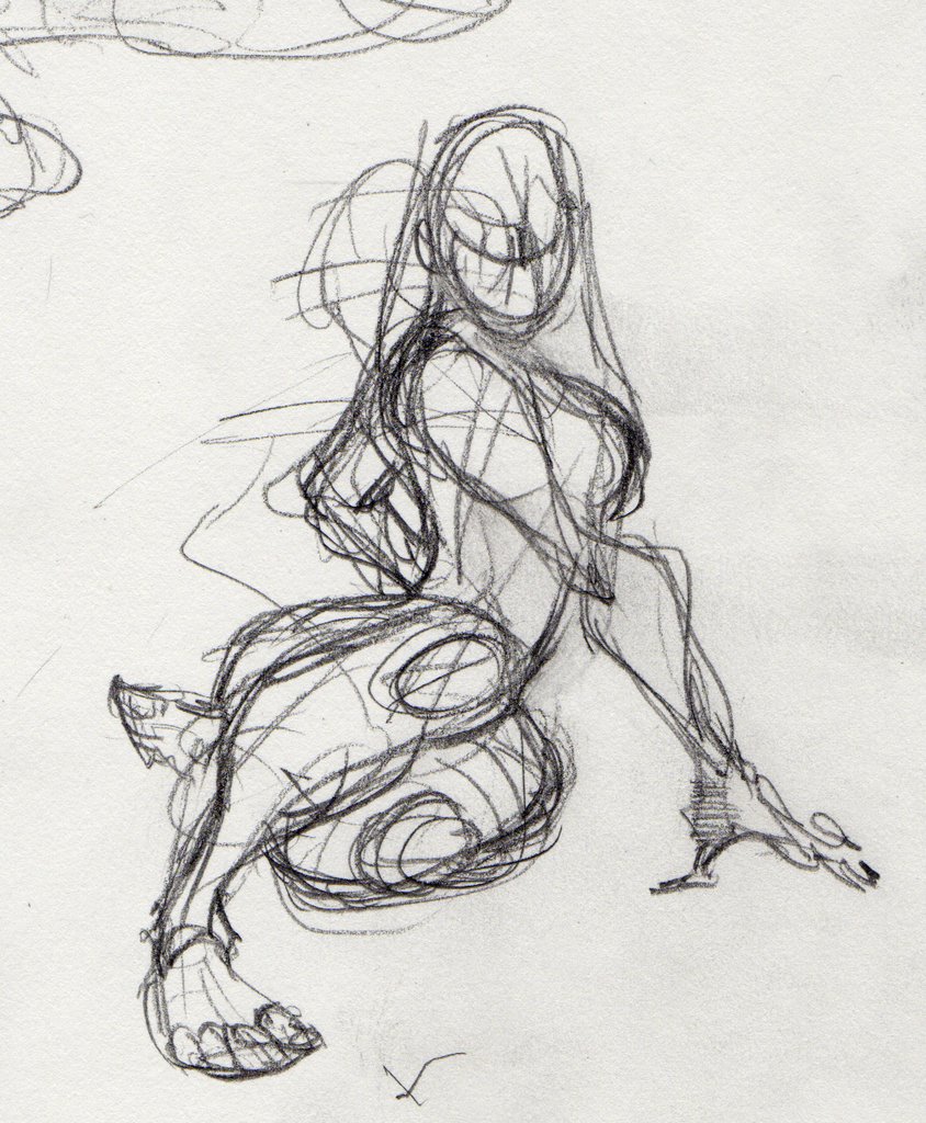
After showing the sketches to my wife and getting her feedback. I decided I liked this one:
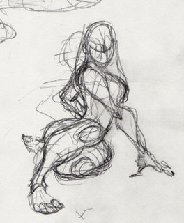
So I ran it up to my scanner, scanned it in and converted the lines to a light blue in Photoshop. Then I printed it out using the "scale to fit media" option in the print preview window which blew it up about 400%.
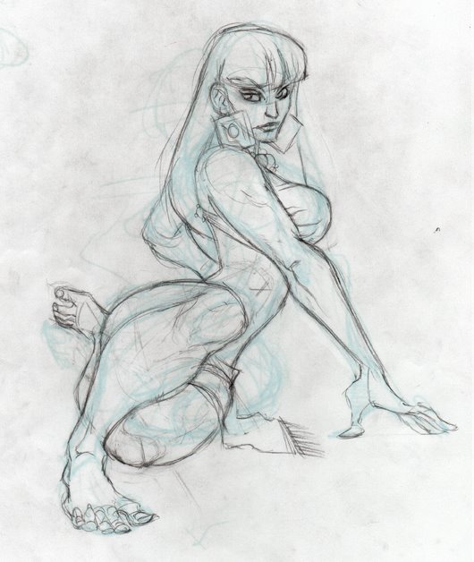
Once I had a print-out with the rough sketch on it, I started sketching over it with a mechanical pencil. At this stage I am trying to build a solid structure, and resolve any issues with proportion and anatomy.
To make these issues easier to spot, I flip over the artwork and hold it up to a light. The mirror image makes problems with anatomy and proportion stick out like a sore thumb. I rework challenging areas until they feel right. There's a temptation to ignore the problem areas here, but I try consciously to find them and redraw them until they work.
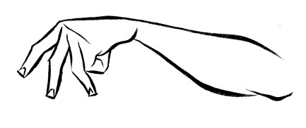
I find her kinked elbow and bottow knee to be particularly challenging so I reference some anatomy books and beg my wife to pose for me, and then keep drawing and erasing until it works.
Mechanical pencil and eraser on typing paper is great at this point. It's a very forgiving combination, and feels more like scultping than drawing as I try and refine the forms.
I'm also trying to focus on keeping the shapes as simple as possible. At one point I draw her arm super chiseled and ripped, and decide that the detail is too much, and not very feminine, so I push it back to a more simplified shape.
At the end of the that stage I've got a rough sketch that looks like this:
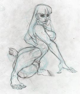
You can see I've also decided on the details here. I really shouldn't have any major changes after this stage, just cleanup and tightening up the details.
There is still one big anatomy issue I need to resolve. Her torso is too long. I ask my wife what she thinks, and she agrees. Normally I don't suggest making fixes in photoshop, but everything else in the sketch is working well enough that I don't think its worth it to redraw the top half, just to scoot it down a quarter inch.
So I scan it back into Photoshop, cut out some waist area, and print it out again as light blue. This time I print it out on and 8.5 x 11 piece of bristol board. We're getting close to finishing!
Now, I do the tight pencil work. The whole purpose here is to create a guide for inks. I've found that tight pencils make for tight inks. When I don't define my lines first in pencil, trying to control my ink lines is like trying to tame a wild stallion. Again I'm using the mechanical pencil. I try and focus on maintaining the freshness of the sketch. I have to redraw the face two or three times until it feels right.
There shouldn't be anything at this point that I haven't resolved or defined. The ink stage should add
very little to what I have here.
*picture of pencils Brandon should have scanned goes here*
On to the inks.
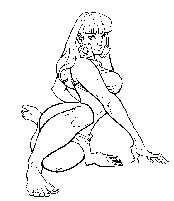
I won't go too in depth on inks right here. Basically I'm using larger strokes for larger shapes, areas of focus, and the underside of objects to give them weight. Smaller lines for details and to suggest form. Even the forms in the background should have some line quality here.
I have to make a couple of fixes with correction fluid, but nothing big.
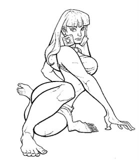
I'm working with 3 different sizes of pen here. A PMOP porous point for the heaviest lines, a pilot fineliner for most everything else, and .02 micron pen for all the fun little details. I wear a cotton glove with the forefinger and thumb cut out to keep my had from catching on the paper and messing up my lines.
From here I scan it back into the computer at a
very high resolution and begin to color. I suggest keeping it over 800dpi. Anything less and the linework starts to suffer when we get into the coloring stage.
From here I followed Ben Caldwell's coloring tutorial found
here.
The great secret here is that to get the best line quality you want to forget about anti-aliasing, and pump up your resolution.
Jordan Crane also has some good words to say on the subject.
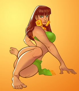
When I got to adding shadow and stuff I got real airbrushy, but I don't think I went too far. Anyway here's the end result:
Labels: Ben Caldwell, Claire Wendling, Jordan Crane, mechanical pencil, micron, pilot fineliner, PMOP, Process, Sketch